
Two-color duotone poster from an AI image with ImageOps.colorize
Turn a Sume image into a duotone: grayscale, autocontrast, then ImageOps.colorize with a dark and a light brand color. Code and ink pairs inside.
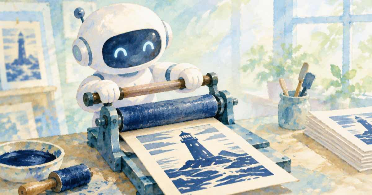
Convert the image to grayscale, stretch it with ImageOps.autocontrast, and map black and white to two brand colors with ImageOps.colorize(gray, black=..., white=...). That is a duotone. It makes a set of mixed AI images read as one campaign, because every image now uses exactly the same two inks regardless of what the model painted.
Why duotone suits generated images
Different prompts and different models give different palettes. A duotone throws that variation away and keeps only the brightness structure, so a portrait, a product, and a landscape all fit one poster series. It also hides small color errors, such as a slightly wrong skin tone, which the brief never wanted to be exact anyway.
Pick a dark ink and a light ink with enough luminance difference. If the two colors are close in brightness, the picture flattens into mud.
The code
colorize takes a grayscale image and linear-interpolates between black and white colors. An optional mid color adds a third stop, which gives a tritone. Hex strings and color names are accepted.
import os, io, requests
from PIL import Image
H = {"Authorization": "Bearer " + os.environ["SUME_API_KEY"]}
def gen(**body):
    r = requests.post("https://api.sume.com/v1/images", json=body, headers=H, timeout=60)
    r.raise_for_status()
    if r.status_code == 202:
        raise SystemExit("queued, read /v1/jobs/{id}/result: " + r.text)
    return r.json()
def fetch(u):
    return Image.open(io.BytesIO(requests.get(u, timeout=60).content))
from PIL import ImageOps
out = gen(model="black-forest-labs/flux.2-pro", aspect_ratio="3:4",
          prompt="Lone lighthouse on a cliff at dusk, dramatic clouds, high contrast")
gray = ImageOps.autocontrast(fetch(out["data"][0]["url"]).convert("L"), cutoff=1)
duo = ImageOps.colorize(gray, black="#1b1f4b", white="#ffd9a0")
duo.save("poster_duotone.png")
tri = ImageOps.colorize(gray, black="#1b1f4b", white="#ffd9a0", mid="#c8456a")
tri.save("poster_tritone.png")
print(duo.size, duo.mode, "cost", out["usage"]["cost"])
Picking the two inks
Test the pair on the light and dark ends before you commit. A rough rule is to keep the dark ink under about 20 percent brightness and the light ink above about 80 percent.
| Dark ink | Light ink | Mood |
|---|---|---|
| #1b1f4b | #ffd9a0 | Dusk, warm highlights |
| #0b3d2e | #e8f5c8 | Botanical, calm |
| #2a0a3d | #ff9ec7 | Pop, high energy |
Things to watch
- Run autocontrast first. A flat, dull source makes a flat duotone.
- Use
cutoff=1to ignore the extreme 1 percent of pixels so a single bright speck does not set the range. - A duotone discards hue, so a red product and a green product look alike. Use it for mood images, not product-accuracy shots.
- Keep the original. Brand teams change their inks.
Check the output against your palette
Because the output only uses colors between your two inks, a delta E check against the endpoints is easy to run. Produce the poster at one size, then derive other widths with the srcset recipe. If you change models later, run your prompts through the regression test to see how the brightness structure shifts.
Sources
Related posts
More in Media tools
- Fades between 2-second AI shots: the 1 s cap and the 8-fade chain
Joining 15 two-second Wan 3.0 shots on Sume Timeline: a fade can be at most 1 s, at most half of the shorter shot, and 8 chained fades are refused. Python.
- Video captions take a public HTTPS URL; other media tools do not
Which URL each Sume video tool accepts: captions fetch a public HTTPS clip, while trim, filter, frames, inspect and timeline need your media.sume.com file.
- Video captions rejects a signed URL: what to send instead
Sume video captions only fetches public HTTPS video URLs and rejects signed, private and localhost links. How to caption a clip that sits behind a signed link.
- Video filter 300 s source cap: trim a long clip first, then filter
Sume video filter rejects sources over 300 seconds while trim and detach take 1800. The output_duration_exceeded error, and a trim then filter order that fits.
Written by Sume